

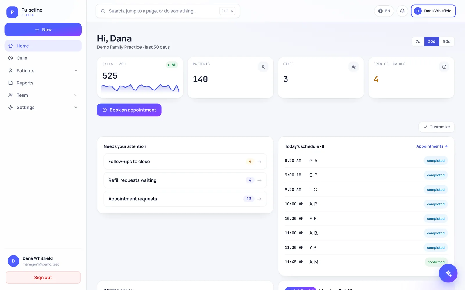


A dashboard should answer one question in under a minute: what needs my attention today? If you have to dig through tabs to find out, it isn't doing its job.
For the front desk
- A short "needs your attention" list: callbacks, refill requests and appointment requests waiting on someone.
- Urgent calls at the top, with who acknowledged them and when.
- Today's schedule, updated as appointments are booked and confirmed.
For the money
- Collections compared with charges, month by month.
- Denials grouped by reason, with what has been appealed.
- A/R aging by payer, so you know what is getting old.
For planning
- When patients call most, so you can staff the busy hours.
- Why they call, so you can fix the common problems.
- Reports you can download and share with partners.
What to skip
Dozens of charts nobody reads. The best dashboards show a few numbers clearly and let you click through for detail. It should also work on your phone, because you won't always be at your desk.
Pulseline and MDClaim360 are built around these ideas: Pulseline comes free with InCareMD front desk support, and MDClaim360 with our billing service.
Want a second pair of eyes? In a free 15-minute review we look at your calls and claims and show you where revenue slips away. Book a free review